Hello friends! Gary here,
Well the morning started out a bit rainy, so we thought it'd be a perfect day to talk about some indoor stuff.... like photo processing!
Ok, so if you have taken our Lightroom work shop you will know that we do about 90% of all our image processing in Adobe Lightroom 5. We do all of our ingesting, keywording, tagging, colour tweaks, spot removal, and even use it to build photobooks for our clients.
In other words, Light room is the sh*t!
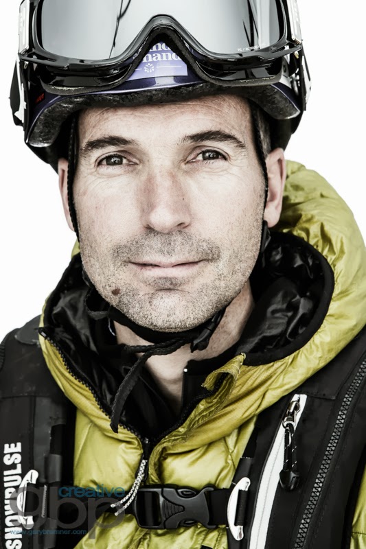
SO, I wanted to show you a bit of before and after action of this image from Dawson City, Yukon we took in the beginning of the summer for our stock library.
Out of camera image, no lightroom adjustments..... blah, flat, laaame!
Lightroom magic..... boom!
Well how did we do that? Below are the the adjustments we did!
- Increase Temp - I like my images to be a bit on the warm side
- Decreased Exposure - image was too bright
- Increased Contrast - to make highlights brighter, and shadows darker
- Increased White - One of my fav tricks to brighten the brighter parts of the image
- Increase Clarity - Love clarity, it adds sweet mid-tone contrast/sharpening
- Decrease Vibrance - I like to drop the vibrance of the colour in all of my images
Basic Panel
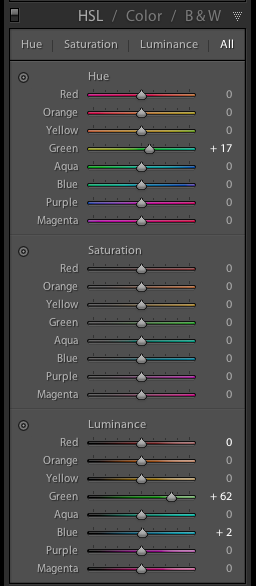
- Green Hue - I upped this a bit to warm up just the green tones in the image
- Green Luminance - I increased this a bit to make the green tones a bit brighter, to help them radiate a bit
- Blue Luminance - I think I just forgot to make it zero.... oops.
HSL Panel
- I just added a bit of sharpening and a bit of noise reduction to smooth things out a bit.
Details Panel
Graduated Filter - These brush tools are the most powerful of the magic of Lightroom:
Graduated Filter
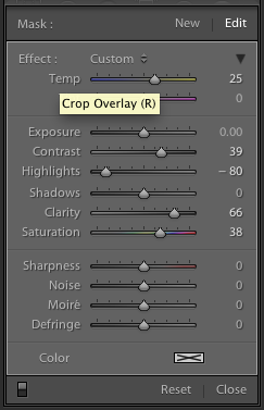
Ok its hard to see but I made a selection of just the sky area:
- Increased Temp - to warm up sky even more
- Increased Contrast
- Decreased Highlights - to try to bring back some of my over exposed sky :(
- Increased Clarity - Love Clarity!
- Increased Saturation - Add a bit more colour to the sky area.
Graduated Filter Panel
Graduated Filter
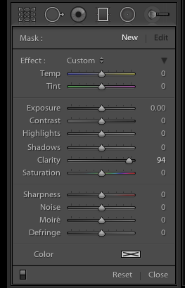
And finally I did another Graduated Filter selection of the lower part of the image:
- Increased Clarity - Love Clarity :)
Graduated Filter Panel
And there you have it! Let me know if you have any questions in the space below and we'll happily reply!


